Padres’ new City Connect uniforms offer nod to Día de los Muertos, Latino culture


For many fans, attending a Padres game at Petco Park goes far beyond the final score. It is an experience rooted in tradition, family and regional pride, in a city where baseball serves as a cultural bridge on both sides of the U.S.-Mexico border.
Their new dark City Connect uniforms offer a glimpse of that cultural tradition, and in more ways than one.
The ideas are reflected in the uniforms’ inspiration: Día de los Muertos, a day of remembrance deeply rooted in Mexican and Mexican-American communities across Southern California and northern Mexico.
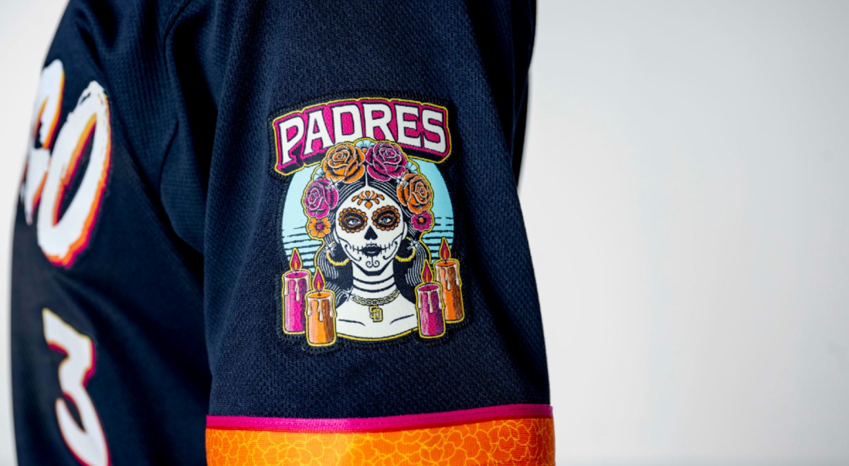
The updated design features a classic silhouette, with pullover jerseys in a deep navy shade the club calls “obsidian” and “San Diego” printed in white across the chest. One of the most striking elements is a sleeve patch depicting La Catrina, surrounded by marigolds—a detail warmly embraced by many Latino fans.
“It feels like a genuine tribute, not just something decorative or promotional,” said Juan Miguel Higueda, a Tijuana resident and longtime Padres supporter. “Not every team acknowledges its fans’ culture this way, and that makes me feel represented.”
The Padres’ decision to update their City Connect uniform was not driven by mandate but aligned with a framework established by Major League Baseball and Nike that allows—and often encourages—teams to rotate designs every few seasons.
Since the City Connect program debuted in 2021, teams have been permitted to replace their uniforms after three years to keep the branding fresh and relevant.
San Diego’s first City Connect uniform—the mint-and-pink design introduced in 2022—remained in use through 2025. That four-year span placed the club squarely within the window for an update, clearing the way for the debut of City Connect 2.0 in 2026. This season, eight teams, including the Padres, rolled out second versions as part of a coordinated league release, though the Friar Faithful had been teased with a few leaks.

Team officials said the redesign represents an evolution rather than a break from the original concept. The new look, they said, draws more deeply on the Padres’ binational identity through a symbolic and traditional aesthetic that sets aside the original’s bright, bold colors for a more restrained and timeless design.
The Padres will wear the uniforms during all Friday home games and during the April 25-26 Mexico City Series against the Arizona Diamondbacks.
Arturo García, 35, brought his son, Arturo Jr., 8, to the stadium on March 26 for the Padres’ season opener against the Detroit Tigers. Like many supporters of the team, the two embrace their team’s long-standing rivalry with the Los Angeles Dodgers.
“I thought we were going to win easily,” García said as he adjusted the Padres cap he had just bought for his son inside the ballpark. He explained that the boy did not want to wait for the newly announced caps tied to the team’s updated look, prompting the purchase that day. The outcome, however, fell short of expectations, as San Diego lost 8-2 to Detroit (the team, however, has had a strong April, going 9-2 so far this month).
García said he had hoped months of speculation and leaks surrounding the team’s new uniforms would have ended by Opening Day, with the Día de los Muerto-inspired jerseys and caps already available.
“I really like the way Fernando Tatis plays,” Arturo Jr. said while browsing shirts bearing the star outfielder’s name in the team store.
In a video posted to the Padres’ social media accounts, Arturo’s favorite, Tatis, said of the new City Connect unis, “Damn, these are sick.” The players, like Tatis, appeared to embrace the new grab.
As another star, Manny Machado, said, “This is old school right here.”